

Findings Analytics
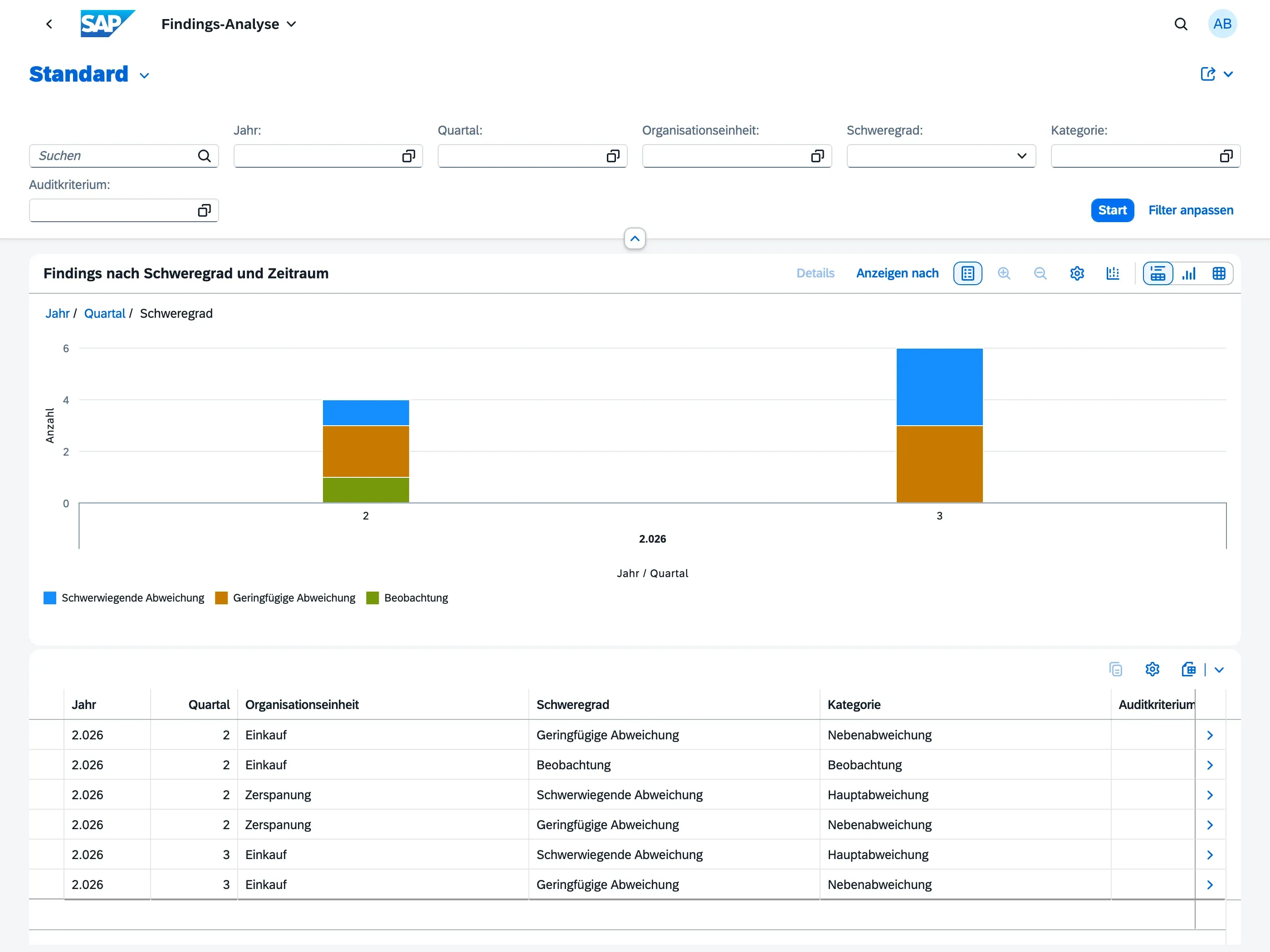
The Findings Analytics dashboard gives Audit Managers a trend view of findings across all audits — a chart of findings by severity over time, plus a table you can drill into by organizational unit, category, and audit criterion. It’s designed for management review meetings, where the focus is on patterns and trends rather than individual findings.
Who can use this
Section titled “Who can use this”- Audit Managers — full access to the dashboard
- Auditors and Auditees do not have access; this view is intended for management-level reporting
The dashboard is read-only — you cannot create, edit, or delete findings from here. To work with individual findings, use the Findings Overview.
What the chart shows
Section titled “What the chart shows”The chart plots the number of findings by year and quarter, grouped by severity. Each severity level appears as its own color in the stacked columns, so you can see at a glance whether findings are trending up or down, and whether major nonconformities make up a growing share of the total.
The period shown is based on when each audit was completed (or, for audits still in progress, when the underlying finding was raised).
Filtering the data
Section titled “Filtering the data”Use the filter bar above the chart to narrow the view down:
- Year and Quarter — limit the trend to a specific period
- Organizational Unit — focus on one part of the organization
- Severity — show only a specific severity level (e.g. only Major Nonconformities)
- Category — filter by finding category
- Audit Criteria — filter by the ISO clause or audit criterion the finding relates to
Choose Go to apply your filters. Choose Adapt Filters to show or hide additional filter fields.
Using the table
Section titled “Using the table”Below the chart, a table lists the same findings broken down by year, quarter, organizational unit, severity, category, and audit criterion, with a count for each combination. Use View By above the chart to switch between chart types, or use the table’s own controls to change grouping and sort order.